In the psychology of interior design, there are various meanings associated with colour, especially in terms of the mood it sets and the feelings they evoke. Colour is a very important component of interior design and architects, builders and designers rely on colour to create a space that will be appreciated by the people who will utilize the space.
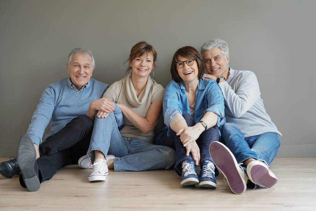
As we grow old, our preferences tend to change to suit our refined tastes. Our health, especially the deterioration of our eyesight, also greatly influence our preferences. Our medical needs also differ and this affects the environment that we live in. It is due to this that architects, builders and designers work hard to create an environment that will make living easier and happier for our elderly family and friends.
In a study conducted by Mather, Stare, and Brenin in 1971 and Wijk, Berg, Sivik, and Steen on 80-year-olds in 1999, saw that the elderly preferred the colours blue, red, green, and yellow. These colours symbolise different meanings, and their psychological effects are greatly accounted for, especially in interior design.
Blue
The colour blue is mostly used in bedroom walls to create a calm and refreshing feeling. Blue walls are mostly matched with wood floors, but carpets in different hues of blue can also be used to complete the look and feel of the room. Blue is best paired with white and other neutral colours such as beige or black, especially since these colours bring out the colour blue and creates a cool and serene feeling. Bedrooms in aged-care homes as well as in hospitality facilities use the colour blue to create a calming feeling, especially for patients that suffer illnesses which require them to be in a serene and calming environment.


Red
Red is the colour of passion, and it generates excitement and exudes energy. The elderly prefer this colour since it evokes sentiments of love and passion, which makes them reminisce and excited about love and life. There are different shades of red that work well with other colours. Primary red works well with green, yellow and blue, primary colours which can be used in walls to match red flooring. Red flooring is best suited in the kitchen when using tiles. Red flooring can give life to bare walls, and it is also a perfect match for wooden cabinetry.


Green
The colour green is usually associated with nature, and the colour usually symbolises life and cleanliness. Aside from being easy and refreshing to the eyes, the elderly prefer the colour green because it gives off an alive vibe, creating the feeling of taking a deep, fresh breath. Green is best matched with the colour brown or with other primary colours such as red, yellow, and blue to imitate nature. The colour is best used not only in bedroom or living room walls but most especially in indoor-outdoor living where green carpets are matched with wooden floors or stone floors to recreate nature inside a home.


Yellow
The colour yellow is usually associated with happiness because it reflects the colour of the sun and radiates brightness. For hospitality facilities, they are best used as carpet flooring in bedrooms so that our aged family and friends will feel comfortable when they walk barefoot and feel warmth and happiness when they wake up. Different shades of the colour yellow can be derived from colourful carpets, and porcelain tiles; but aside from those, engineered vinyl tiles, as well as natural wood flooring, also have different hues of yellow that can be used in hospitality and aged-care homes. Yellow flooring is used in corridors and hallways to brighten these dull spaces. Wood flooring in different hues of yellow is also a popular yet classic choice for living rooms. Engineered vinyl flooring is also best used in exam rooms or clinics in hospitality facilities to give off that warm feeling.


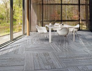 Aside from these specific colours, Interface’s Biophilic Design best suit hospitality properties because this type of design flooring imitates the look and feel of nature where the colours blue, red, green, and yellow can be found. Interface’s Biophilic Design aims to connect humans to their surroundings by mimicking natural surfaces and textures and consciously including patterns in nature in interior and architectural design.
At Creative Flooring, we work with trusted flooring manufacturers such as Nolan Group, Polyflor, Dunlop, Woodpecker Flooring and Interface Australia to bring exceptional flooring, especially to hospitality facilities. In our recent flooring installation at the Meath Care Inc.’s Retirement Village Clubhouse in Kingsley, we’ve used Nolan Group‘s Toli Mortarclay Carpet Tiles in shades of green and brown to reflect comfort and especially since the colours are easy on the eyes.
For flooring enquiries, get in touch with us on 0422 945 262 | info@creativeflooring.com.au